Sometimes things come together as a result of months of planning and a steady, methodical process of creating and refining content. Sometimes, they come together as result of 30-minute, back-of-the-envelope improvisations. A recent interactive package that I pulled together to celebrate Black History Month was definitely the latter.
On the morning of February 1, a colleague at the Duke Graduate School emailed me a spreadsheet of all of the Black PhD graduates in the school’s history and asked if we might do something with this for Black History Month. Upon scanning the list, my initial reaction was “Yes, we can and we should!”, followed by “Oh crap! Black History Month starts today!”
A Plan for Now, and Later
To acknowledge the obvious, we absolutely should have started planning for some kind of Black History Month package much sooner. Alas, we had all been buried in an intense deadline project during January and another such project in December, which left virtually no headspace or time to think about much else. So, on the morning of February 1, I found myself with some promising building blocks but very limited time to turn them into a deliverable.
So I started laying out ideas, priorities, and parameters in my head. First and foremost, the turnaround was short because I needed something for that day to acknowledge the start of Black History Month. After that, I needed to find more information to flesh out the list of names and graduation dates that I had on hand.
Within a half hour, I had drawn up a rough plan for a package that would include four pieces of content:
- A story on Duke’s first two Black PhDs
- A look at the first wave of Black PhDs, with short bios on each
- A data visualization of the number of Black PhDs over the years
- A look at the first Black graduate of each Duke PhD program
The first piece — a story on Duke’s first two Black PhDs — was already done. We had written that story a few years ago as a part of another project, so it was just a matter of resharing that story on social media and incorporating it into the larger Black History Month project. By leading off with this piece, it gave us something we could share immediately to acknowledge the start of Black History Month, and it bought me time to pull together the other three pieces.
As for those other three pieces, I knew that, as a one-person communications operation, it would take me a couple weeks to pull those together, and that’s if nothing more pressing came up during that time. As impressive as it would be to launch them as one big package, taking that approach would also mean going weeks into a short month without anything more than our initial social media posts about the “First 2 Black PhDs” story from four years ago. That felt unsatisfying for a school that has made diversity and inclusion a major priority.
So I took a different approach: I would roll out one of those three pieces each week for the remaining three weeks in February. That would give us fresh content every week and celebrate Black History Month throughout the month rather than push out a bunch of content all on one day and then not really mention it again. This also bought me more time to produce each of the pieces.
Week 1: First 2 Black PhDs
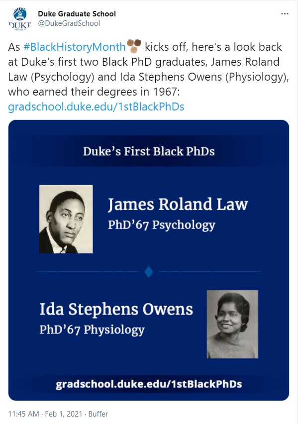
For the first day of February, I spent about 20 minutes creating some social media posts, with a new graphic, linking to the old story on our first two Black PhD graduates:
Week 2: First Decade of Black PhDs
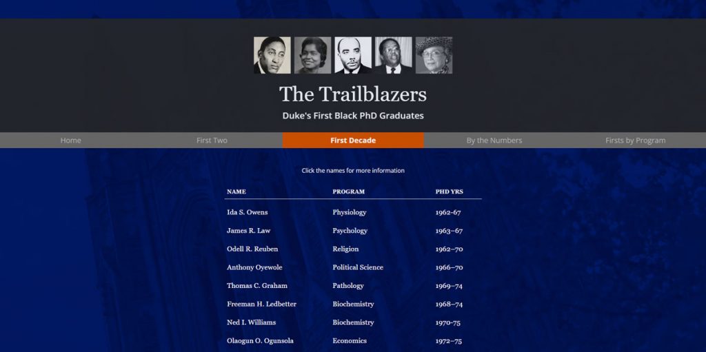
As soon as the week 1 social media posts were done, I began work on the week 2 package: a webpage looking at the Black PhD graduates from the first decade. This came out to a list of 20 names. I already had their programs and year of graduation. What I needed were short bio blurbs and ideally a photo for each graduate.
Before I started searching for those assets, however, I first mocked up a design for the webpage. Given the time constraints, I decided to keep it simple and clean:

The idea here was that you can click on each name and a lightbox would pop up to display the bio info. However, this design was also set up with the thought that if I couldn’t find enough info or photos to actually build out the bio blurbs for most of the graduates, the page could exist as just a list. Taking the continency planning a step further, if some emergency came up and I simply do not have time to code the actual webpage, then I could just tweak a few things on this page and output it as a static graphic and go with that. This kind of contingency planning — leaving myself an exit ramp — is something I try to incorporate into communication strategies around special projects.
Fortunately, I did not need to use those contingency plans in this case. Through a combination of internet research and in-house databases, I managed to track down at least a few tidbits about each person on the list, and even found headshots for most of them.
Hand coding the page was a fairly simple matter, given the relatively simple layout. I did end up deviating from the original two-column design and just went with one column so as to make mobile optimization easier.
For the lightbox feature, I used Lity, a lightweight JS plugin that I had employed for a previous project. This choice was in part due to my existing familiarity with that plugin, since time was a premium on this project. This is why I always make it a point to play and experiment with new tools in my down time, so that in crunch time, I have go-to tools that I am confident I can deploy quickly and successfully.
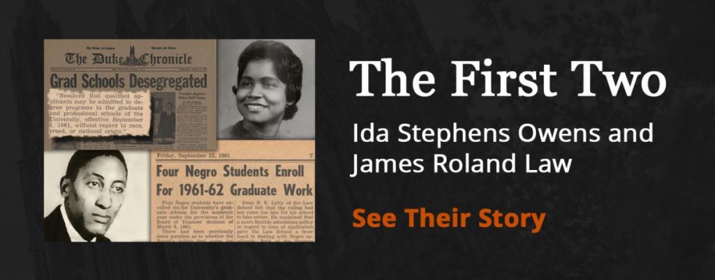
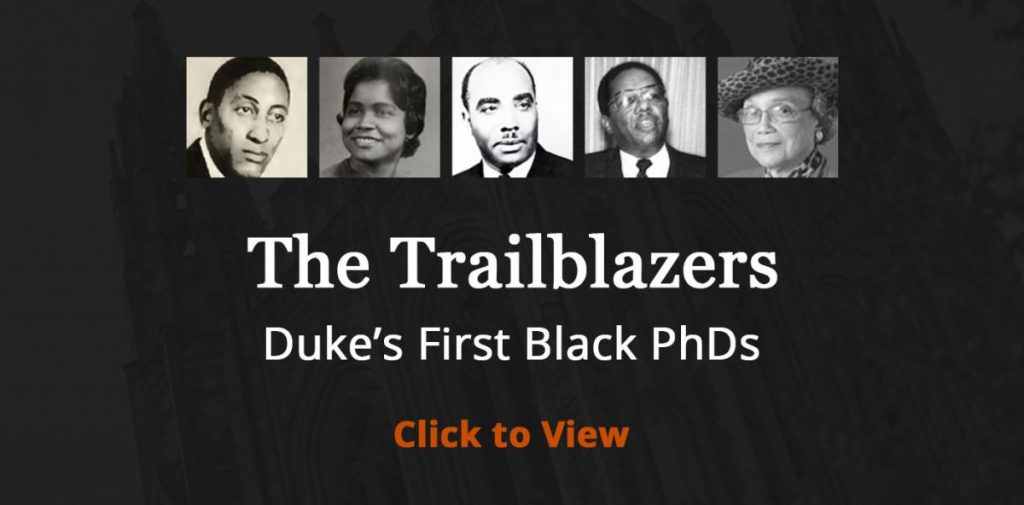
Now that I had two pieces of content in the Black History Month package, I created a page on the school website to keep a running compilation of the pieces. This would be a page that I would promote as the month went on. I also added a note on the first piece, mentioning the Black History Month package and linking to the compilation page. Finally, to bring a unified look to the package, I designed similar promo graphics for each piece of content:
At the same time I was working on this package, I asked my intern to start cleaning up the data that would populate our week 4 package, an interactive timeline listing the first Black graduate of every PhD program.
Week 3: By the Numbers
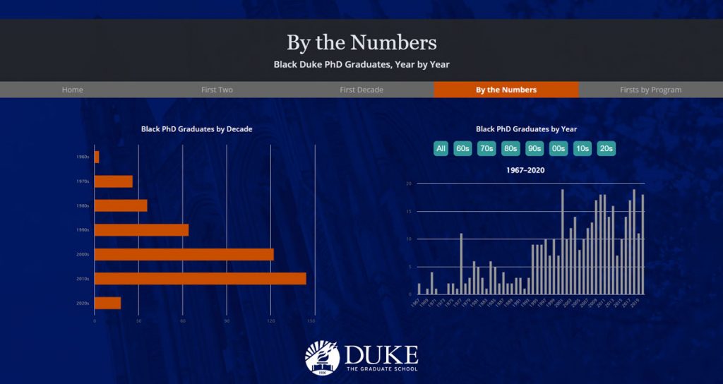
The week 3 piece was a data visualization dive into the number of Black PhD graduates through the years. Data visualization is perhaps my favorite subfield of visual communication, and in this case, it was a good way to show not only the increase in Black graduates, but also the fact that, until fairly recently, the number of annual Black PhD graduates were in the single digits. This piece would both illustrate the progress that has been made and serve as a reminder of the work that still needs to be done.
Putting this package together was a relative breeze compared to the research-intensive work of week 2. All the data on the number of Black PhD graduates through the years were in the spreadsheet; I just had to count up the rows under each year. Also, the webpage template was basically already done, as I was just reusing the week 2 design.
The main challenge of week 3 was refamiliarizing myself with Highcharts, an infographic JS plugin that I had used (but in a while). Here again, I had contingency plans. In a worst-case scenario, I could just create static infographic images in Illustrator and place them on the page.
The Highcharts code cooperated, and I was able to produce a number of interactive bar and column graphs without much trouble. Then it was just a matter of figuring out on the fly how to code a “click to change div content” interaction. This was something I had done a couple times before, so I was relatively confident that I could do it, even if not in the exact way as before.
Here’s the final page for week 3:
Week 4: Interactive Timeline
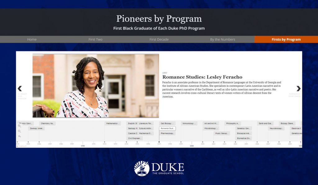
We were now in the final stretch. The piece for the last week of Black History Month would be an interactive timeline displaying when each PhD program had its first Black graduate and providing some info on that graduate. For this, I had enlisted the help of my intern starting back in week 2.
When I drew up the initial communication plan and penciled in a timeline for week 4, I immediately knew that I would use Timeline JS, a wonderfully simple interactive timeline creator from Knight Lab. The great thing about this tool is that it doesn’t really require any coding skill to create a timeline. You just have to fill in a Google Sheet with data.
By the start of week 4, my intern had more or less finished cleaning up the data. Then it was just a matter of generating some embed code and slapping it into the webpage template I’ve been using. I then spent an extra day double-checking all the bio info and writing some additional CSS to tweak the look of the timeline.
Here is the final page for week 4:
All Together Now
Now that all four pieces were done, I decided to go back and create a true landing page for this package, repurposing the promo graphics I made for each week’s piece:
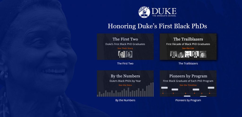
All in all, this package finished the way I envisioned it in its entirety: an interactive package with a nice variety of content, but all revolving around a common theme. By spacing out the pieces throughout the month rather than trying to churn it all out at one time, I created additional time to produce each piece AND enabled us to have fresh #BlackHistoryMonth content every week. The package was well-received internally and received some nice comments when we shared it with some of our external constituents. The fact that its content is historical means that there really is no expiration date on this information, so this will remain a piece of evergreen content that we can reuse in the future.
