In communications, we spend a lot of time making stuff: writing stories, designing graphics, taking pictures, shooting videos, composing social media posts ….
And how do we measure the impact of all that output? There are metrics, of course: clicks, views, likes, shares, time on page, bounce rates, fancy formulas that assign a monetary value to users, and so on. But what do those things actually translate to? How much do a few extra clicks or an additional minute spent on a page actually contribute to our organizations’ mission and serve our constituents?
When you get right down to it, the actual impact of so much of what we create as communicators is “soft.” We usually cannot point to a tangible benefit and say, “My work made that happen.” Sometimes, one can’t help but wonder if we are mostly just pumping more content through the firehose, to be quickly skimmed and just as quickly forgotten amid a million other pieces of content competing for attention.
That’s why my favorite projects are those that give me the opportunity to put my communication skills to use on something with much more tangible benefits. One such opportunity came in fall 2020.
A graduate student had developed a PowerPoint-based guide to help fellow students better understand the options and processes for reporting harassment, discrimination, and other misconducts they might encounter. Anyone familiar with higher ed probably knows that these are significant issues in academia, particularly for graduate students due to the tricky power dynamics in their training environments. This is a big, complex problem requiring solutions on many fronts. One of those fronts is making sure students have good, clear information about their options and resources should they find themselves in a toxic situation.
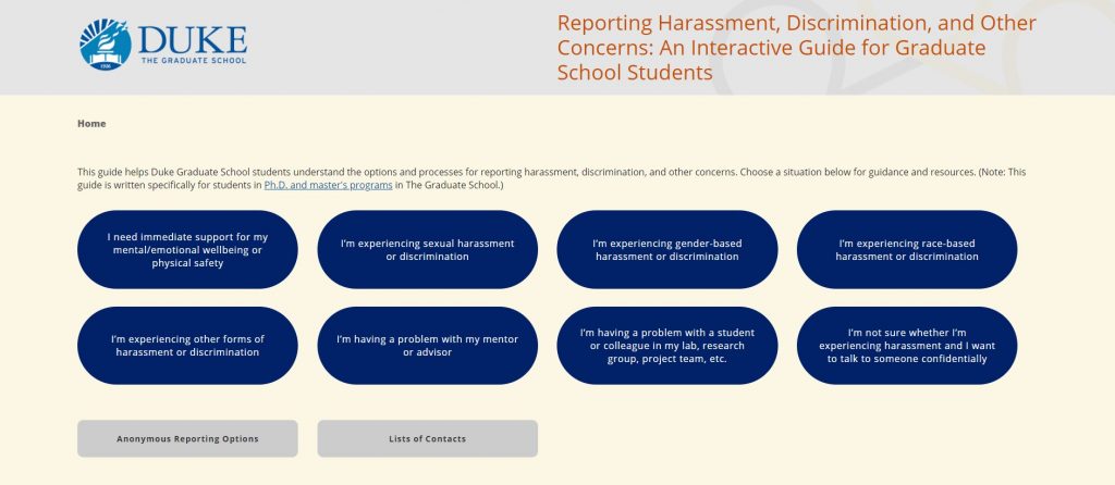
That’s where this graduate student’s guide came in. She envisioned it as an interactive tool that walks users through various scenarios and succinctly explains the options and processes at each step. The guide was originally created for students in a handful of PhD programs housed in one of the schools. As soon as I saw the PowerPoint, however, I could tell it was a great concept and, with some work, would make for a terrific resource for all the students in The Graduate School.
So, I offered to do just that. This wasn’t really a natural fit on my list of usual responsibilities. It’s unlikely someone would say, “Hey, let’s ask our PR guy to develop an online guide on reporting harassment.” Nonetheless, I claimed it because I knew that in a higher ed setting, these types of projects — particularly ones stemming from students — aren’t really natural fits on anybody’s list of usual responsibilities. Yet they need a champion within the institution — someone who will invest either time or money (to buy someone else’s time) to turn a good idea into a viable product and maintain it. If no one takes ownership of it, there is a good chance the idea would sit neglected and eventually forgotten in a miscellaneous folder. I didn’t want that to happen to a promising project like this one.
Mapping It Out
The most obvious change I wanted to make was to take the guide out of PowerPoint and turn it into a mini-website, and one that would be mobile friendly since I could envision users pulling this up on their phones when they need the information in a hurry.
The first step in that process was to go through the interactive PowerPoint and map out where every click led. Once I sketched out this sitemap, I looked for ways to simplify the structure and streamline the flow. In the end a 30-plus-slide PowerPoint slimmed down to about 20 webpages.
Mockup
Sitemap in hand, it was time to mock up the design. The original guide was heavy on the use of buttons, and I retained that aesthetic, in part because it would fit well with a responsive design on mobile. I kept the overall aesthetics clean and simple so as to focus users’ attention on the short text blurbs and buttons. Also, in a nod to the original guide, I retained the interlocking loops graphic from the opening slide as a background element in the header.
Original design:


New design mockup:


Coding
With the fairly simple design, the coding was pretty straightforward, using standard HTML and CSS. I also used a Javascript plugin for the lightbox effect, which I employed to streamline some navigation steps.
After I finished the coding, I sat down with Duke’s accessibility guru and we went over some simple tweaks to make the pages friendlier to screen readers and keyboard navigation. During this process, I was pleasantly surprised to learn that the JS plugin for the lightbox had the added benefit of already being very accessible, such as ensuring that screen readers read the lightbox content properly.
Content
The design and coding were probably the easy parts of this project. The more labor-intensive portion was editing the content. Because the original guide was created for just a few specific PhD programs, we had to go through all the content and identify places where we needed to expand the scope of the information so that it applies to all our students. At the same time, we wanted to preserve one of the qualities that made the original guide so useful — its specificity. That was a somewhat trick needle to thread. To do this, I sat down with a couple colleagues at The Graduate School who frequently handled student cases, and we went through each page and talked through what changes were needed. In the end, I think we struck a good balance between broad enough language that covered everyone and providing specific enough information that students can easily find what applies to their specific circumstances.
Test, Revise, and Review
Once those content changes were made, it was time to show this guide to some test users and see what issues cropped up. I am a big believer in usability testing, but with the pandemic and a tight timeline, we were not able to do full-fledged usability tests. Instead, we recruited about a dozen students, faculty, and staff, and asked them to take the guide for a test drive on their own time and share feedback with us. I provided some guiding questions to help ensure we get feedback in a somewhat structured manner.
We received a lot of really thoughtful comments. From those, a few clear themes arose, pointing to certain needed tweaks, mostly dealing with specific wording. There were also some suggestions that could be worth considering, but would require too much time to implement at present. So those were saved for possible future revisions.
Once we made revisions based on that feedback, we pulled in colleagues from relevant university offices to make sure the information we were providing was accurate and complied with legal requirements. Fortunately, we got through that process without significant changes.
The Rollout
So far, my role in this project had been that of web developer, designer, content editor, and project manager. Now that the guide was ready to go live, it was time to jump back into my more conventional communications role. A key reason I took on this project was that I felt the guide’s purpose fell right in line with The Graduate School’s mission of supporting our students and enhancing their experience.
To tell that story of the school collaborating with our students to better serve them, I wrote a profile of the graduate student who created the original guide. The story was centered on her efforts (as it rightly should, given how much of her original concept and content our guide retained), but also described how The Graduate School helped turned her original idea into a tool for a much larger population. I really relish the stories where we can 1) highlight the wonderful work that our students are doing, and 2) demonstrate how The Graduate School supports that work. In this case, it’s extra sweet because I wasn’t just writing about the work; I also did the work. I guess I was making my own good press in a way (it’s amazing how easy it is to talk about doing good things when you … you know … actually do good things).
Ultimately, though, this effort was first and foremost about helping students, and I am hopeful we did that. The guide is now live. Based on the enthusiastic reception on social media on launch day, as well as comments we received from the test group during development, it seems many students indeed see this as a useful and needed resource. This was a really fulfilling project to be a part of — one that drew on my communications skills and resulted in clear, tangible benefits for our constituents.
UPDATE (June 23, 2021): The student who developed the original concept and I recently gave a presentation about the creation of the guide at a graduate education virtual showcase hosted by the Association of American Universities. Watch the recording if you are interested (our segment starts at 3:40).