web
UNC Pharmacy School Website
pharmacy.unc.edu (Site has since been redesigned)
From 2007 to 2014, I oversaw the website for the UNC Eshelman School of Pharmacy. During that time, I helped to greatly expand and enhance the site's content, improved its information architecture, and helped to oversee a significant revamp and redesign.
The pharmacy school's site was large and complex and served the needs of a variety of stakeholders. Chief among them were faculty, prospective students, current students, staff, and administrators, all of whom had different priorities and needs. As part of a two-person communications team working on the website, I helped to engage these stakeholder groups, understand their needs, and developed new features on the site to meet those needs.
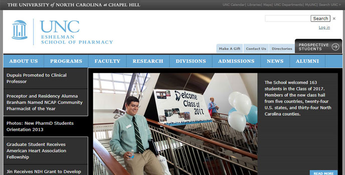
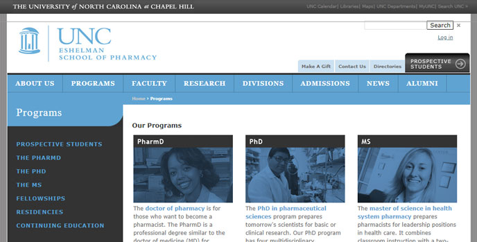
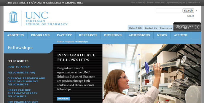
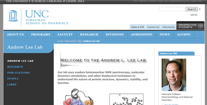
In 2010, I helped spearhead a redesign of the site. I shepherded the project through the various stages of the development process and kept stakeholders engaged and informed, in part through a committee of faculty, staff, and students. I created the initial wireframes and mockups for the home page and other key pages, and then worked with outside developers to flesh out the vision for the new design. At various points in the process, I prepared presentations to the web committee and senior leadership to get their feedback and buy-in. The end product represented a significant improvement over the previous incarnation of the site. Aside from being more visually appealing, it also had new features that made it easier to highlight the work of the school, its faculty, and its students. We also developed additional functionalities that made content creation and site maintenance significantly easier.
Note: I left the school in 2014. The website has since been redesigned again, so I am providing some screenshots of the site as it appeared after the 2010 redesign, along with a screenshot of the old design for comparison.


