web
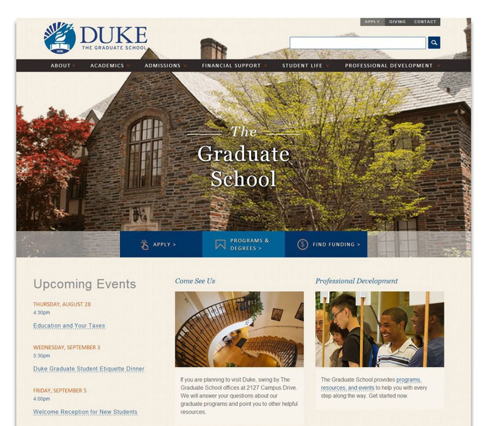
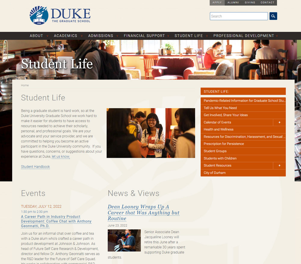
Duke Graduate School Website 2014 Redesign
gradschool.duke.edu (Site has since been redesigned)
In 2014, I joined the Duke Graduate School to oversee its communications operation. On my first day, I was told, "Welcome aboard! Oh by the way, we started a website redesign last week."
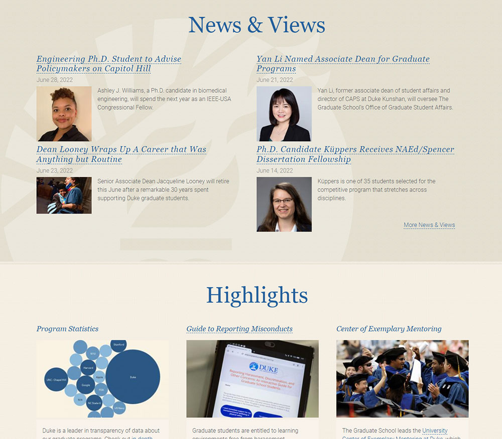
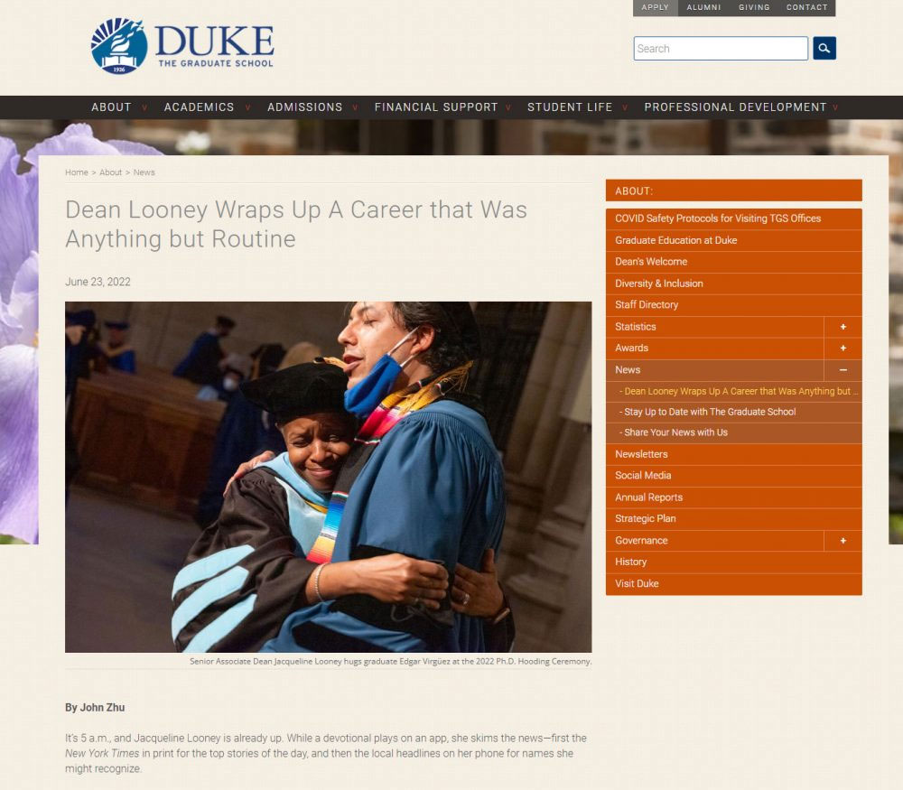
I quickly got up to speed and, over the ensuing six months, oversaw a successful revamp that dramatically improved the school website in every aspect and turned it from a site that didn't really have a news section to a platform that can support the kind of robust storytelling I had envisioned for the school.
To make that happen, I worked closely with internal stakeholders to assess the school's day-to-day website needs and translated those into technical specifications for an external team of developers. I strategically shephered the redesign through various stages of internal review and approval, and did significant hands-on work in migrating and revamping the content.
The end result of this work was a site that
- represented a huge improvement in design, functionality, and user experience;
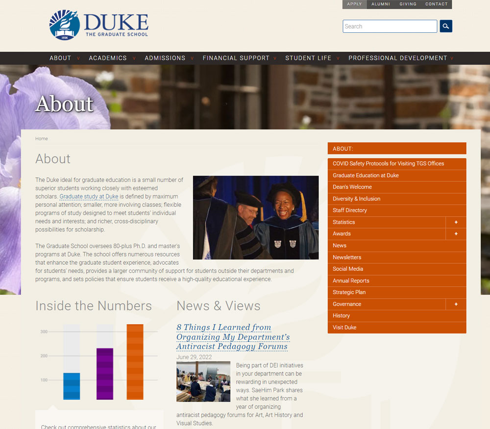
- had a new and improved information architecture;
- had hugely improved and streamlined content (I spent a month rewriting literally every evergreen page); and
- was set up to support greatly expanded storytelling.
The new site launched on time and on budget. It was very well received within The Graduate School and by other stakeholders at Duke. It was also selected by eduStyle as the Best School, Department or Faculty Site redesign of 2014. It held up well over the ensuing eight years until undergoing another major redesign in 2022 to update its appearance, finetune its user experience, and expand its functionality.


