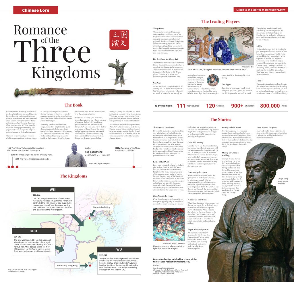
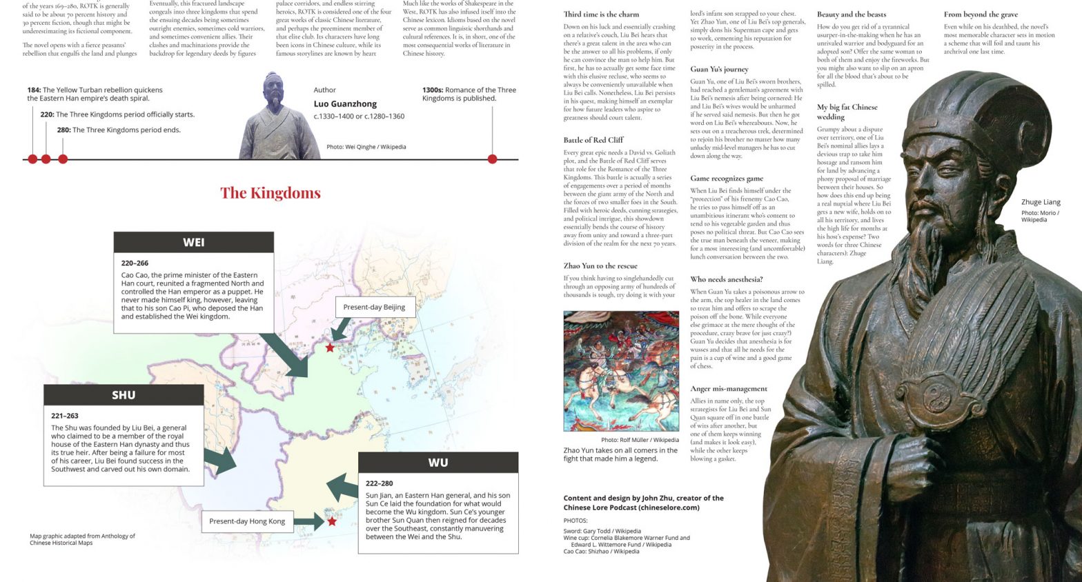
I’ve designed content for a lot of different formats and mediums, both print and digital, but nothing quite compares with the special appeal of a newspaper spread. Sure, space is essentially infinite on a webpage, but a newspaper spread’s canvas somehow feels larger and yet at the same time more contained and digestible.
When I’m designing a newspaper spread, that large canvas is mentally broken down into a number of regions and micro-regions. Within each of those smaller areas, there are space limitations that compel you to design and edit tightly.
Creating a newspaper spread, therefore, is a series of balancing acts as you negotiate the limitations of each area of the spread, and all those regions and all those decisions come together to (hopefully) form a cohesive whole. It’s Gestalt at its finest. If you do it right, the end result is a product that offers substance, visual appeal, and just the right amount of information for a pleasant reading experience, where every design choice is concise and deliberate and not an extra unnecessary word is added and not a single pica is wasted.
I haven’t had the opportunity to design newspaper spreads in my primary job in a long time. To scratch that itch, I recently created a spread on a subject I know well — the classic Chinese novel Romance of the Three Kingdoms, which was the subject that launched my now almost decade-long foray into podcasting.


