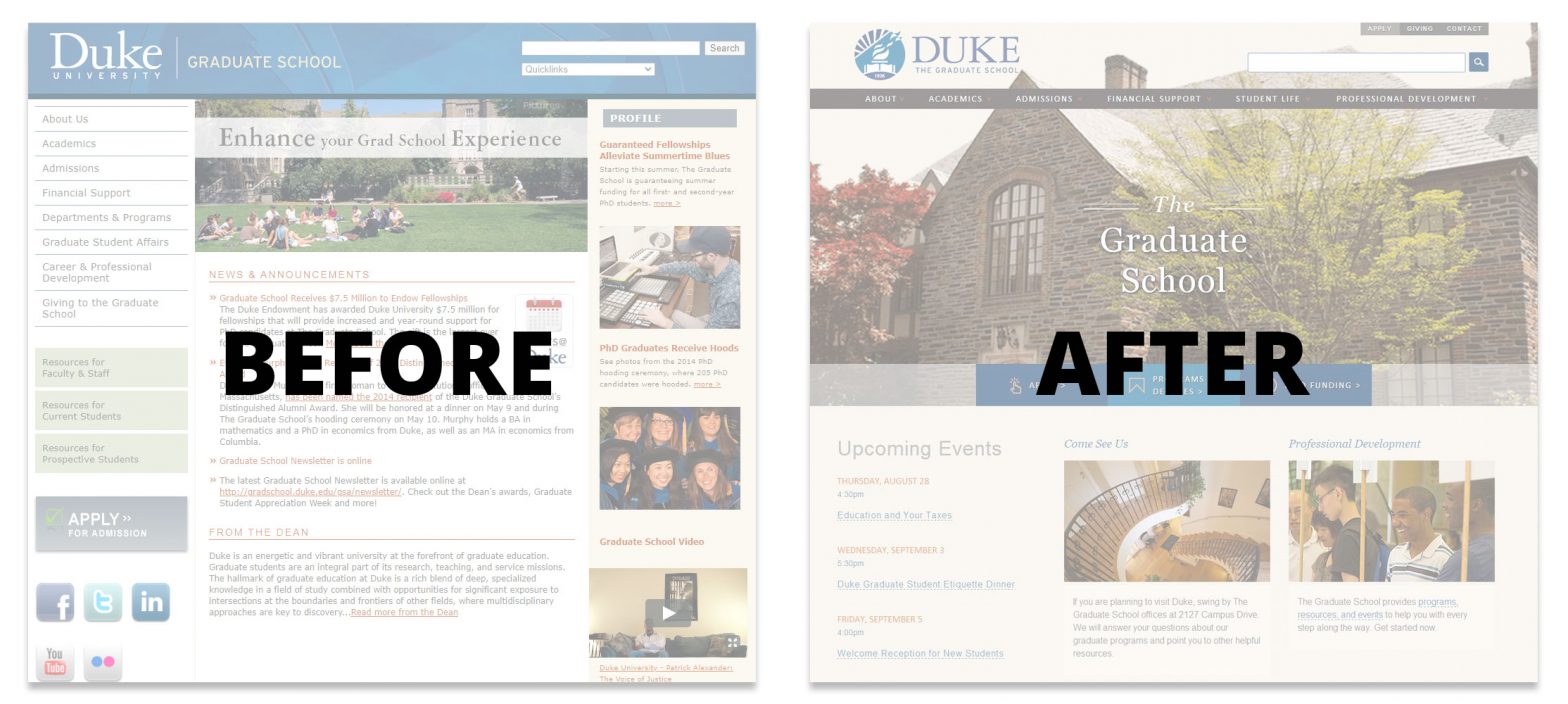
In March 2014, I became the Senior Public Affairs Officer at the Duke Graduate School, which meant I was going to oversee all aspects of communications for the school. One of my primary responsibilities was the school’s website. On my first day, I was essentially told, “Welcome aboard! Oh by the way, we started a website redesign last week.”
Over the ensuing six months, I led the redesign from the school side, working closely with internal stakeholders and the external vendor that was overseeing the development of the site platform and design. The end result was a successful revamp that finished on time and on budget and dramatically improved the site’s aesthetics, functionality, and user experience.
From Going Along for the Ride to Steering the Ship
Given that I was going to lead a project that had already started without me, I immediately got to work. I engaged a small committee of internal stakeholders that represented each of The Graduate School’s offices (student affairs, admissions, academics, finance, dean’s office, and development). I had conversations with members of each of the offices to understand their mission and their website needs. I also met with the vendor, Duke Web Services (DWS), to understand the work that they had already done.
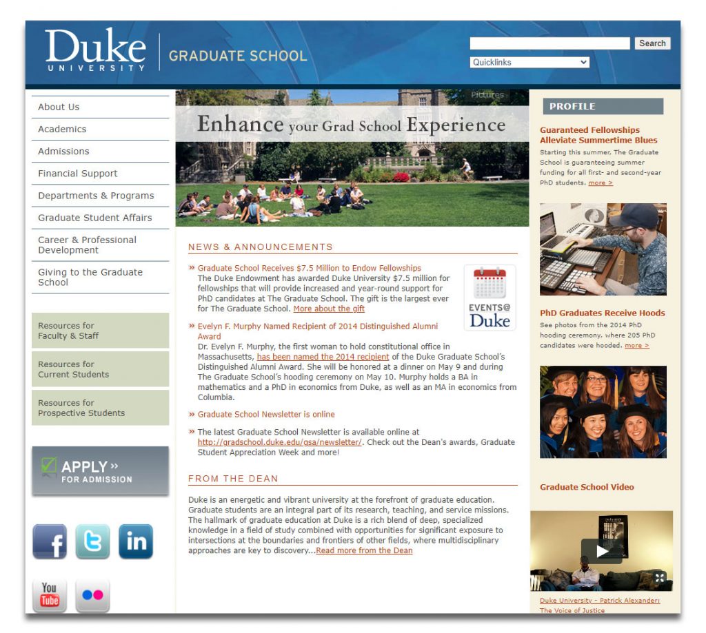
Over the first couple months, I worked with DWS to review the findings from their stakeholder interviews and other research, which then guided the information architecture of the new site. One significant change was that whereas the previous site architecture was built to reflect the school’s organizational structure, the new site’s architecture would be built around major buckets of information that users are coming to the site for.
While this was a logical, overdue change, it was also one that carried sensitivities. Some internal stakeholders were attached to having their office’s name in the site’s main navigation. Also, some of the buckets of information happen to have the same names as some of the offices, but not all, so it could seem like some offices got to keep their names in the navigation while others did not.
To gain buy-in, I spent time talking to each office about the change and reassuring them that 1) this change better serves our students, which in turn means it better serves the offices that support those students, and that 2) it does not mean we are de-emphasizing the role or visibility of any particular office. Those conversations were fruitful, and all the offices bought into the new information architecture.
Next came the design. DWS worked on wireframes, which I reviewed and provided feedback. I decided to hold off on presenting anything to the internal committee until we had high-fidelity mockups. Members of the committee were not communicators or designers, so I wanted to avoid having them misinterpret rough wireframes and risk allowing that to taint their view of the design.
As we started receiving high-fidelity mockups, I reached out to individual offices to discuss certain designs specific to their area, so that they were not surprised when they saw the mockups at the official presentation. These conversations not only resulted in some good feedback before the presentation, but also ensured that I headed into the presentation with a certain amount of buy-in already in the bank.
Helped by this groundwork, the official presentation of the mockups to the committee was a success. The mockups were approved with only minor alterations and received overwhelming support from the committee. This then provided important credibility and backing when I presented the design to senior school leaders, who also approved them without significant changes.
Content, Content, Content
Once DWS set up the site platform, CMS, and design, it was time to migrate the content. The school’s previous site content suffered from many of the typical pitfalls of an academic institution website, chief among them being long, jargon-filled pages. After an extensive review of the site content, I decided that instead of just copying over problematic pages, I would take this opportunity to clean them up.
For the entire month of June, I focused on site content. I rewrote or edited almost every evergreen page (which numbered in the triple digits) so that the language was succinct, clear, and useful. Along the way, I tweaked the information architecture as needed. This process required significant back-and-forth with various internal stakeholders to ensure that the revised content was accurate and met their business needs. When July rolled around, I delivered all the revised content to DWS, whose team put it into the new site. DWS also migrated existing news articles and posts from a blog that the school had started a few months earlier.
While the site was being populated with the revised content, I began using the CMS to build out the home page and other major landing pages. As I did so, I reviewed them with the relevant stakeholders.
By mid-August, the site was essentially ready. After a couple more weeks spent doing a detailed review to ensure everything was working correctly, we launched the new site in early September.
Results
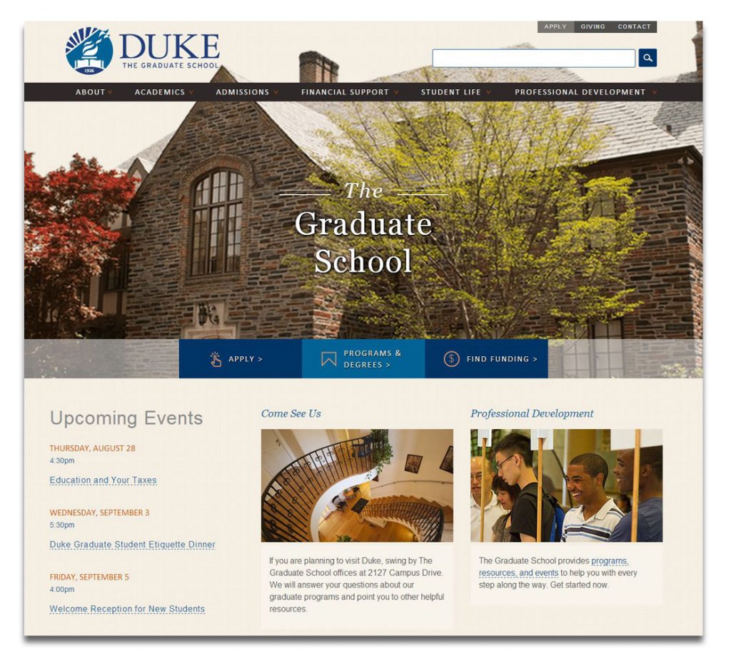
The site was very well received within The Graduate School and by other stakeholders at Duke. It was also selected by eduStyle as the Best School, Department or Faculty Site redesign of 2014. More importantly, it served the school’s needs significantly better than the previous site.
The new site represented a huge improvement in design, functionality, and user experience. The old site was filled with dense passages of text, including on the home page. The new site employed visuals and white space much more prominently and effectively, and featured more readable typography.
Functionality-wise, the new site boasted a calendar module, which was a crucial feature as the school was at that time greatly expanding the number of professional development workshops and programs that it offered. The new calendar module made the website a much more effective vehicle for promoting these new resources, which formed a significant part of the schools’ work.
We also built a database of funding opportunities for graduate students, which allowed them to easily filter the list of opportunities by various parameters.
The new site also offered new promo modules that allowed us to more effectively highlight various aspects of the schools’ work. There were also new features and content types that made the site a much more effective storytelling tool.
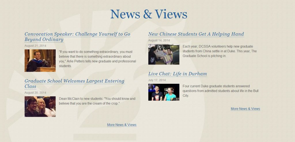
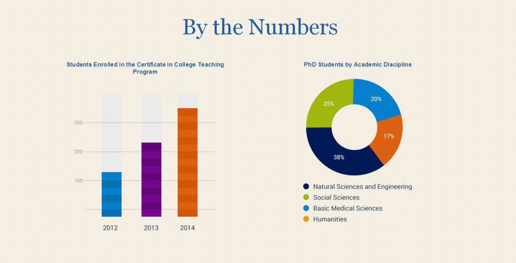
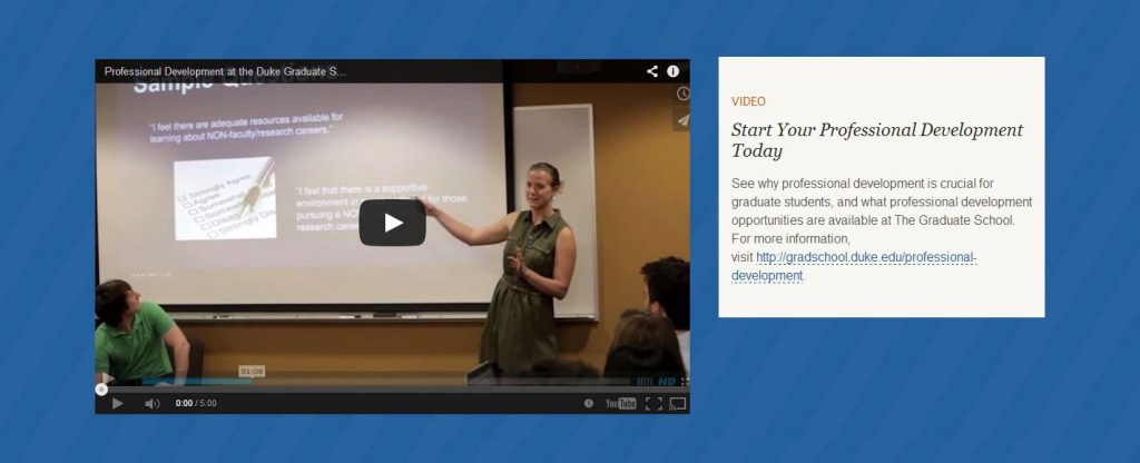
These tools were extremely important because, as the person overseeing the school’s communications, I knew that a key focus of my work would be to greatly expand our storytelling. It was therefore vital that our new site supported this content strategy. The old site did not even have a consistent way of publishing and organizing news articles. Looking back several years later, it’s clear that the site has fulfilled this aspect of its purpose. We have produced a large archive of news and features, many of which were accompanied by large, appealing photos, videos, and infographics.
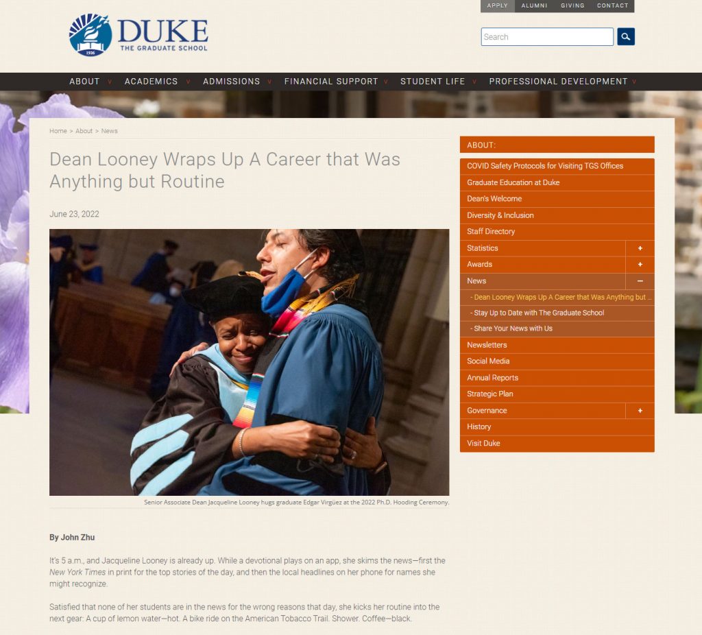
In the eight years since the new site launched, we have continued to make incremental improvements to the user experience, information architecture, functionality, and content. We have also continuously monitored site analytics and conducted occasional content audits and user research to better understand our users’ needs and identify areas for improvement. All of those insights were of immense value when the site underwent another significant redesign in 2022, which represented another significant leap forward for the site.

