As a lover of all things Photoshop, I always relish opportunities to put together a fun photo illustration. Sometimes that means creating something really complicated entirely in Photoshop. Other times, it’s about using Photoshop to add one crucial component to an image, and that’s what I did on a recent piece, with good results.
One of my interns had written a story about two students who were researching immunotherapy for brain cancer. We needed art to accompany the story, so I set up a photo shoot with the students. Unfortunately, we faced several challenges:
- The university’s COVID policies required that everyone be masked while indoors. That meant if we did the shoot inside, the students’ faces would be hidden behind masks. I didn’t want that, so we moved the shoot outside.
- There were not exactly a lot of distinct visual elements outside the students’ lab building, which one student described as a typical concrete block. There was definitely not anything that showed a visual link to their research on brain cancer.
- The students did not have any thematically relevant props that might be incorporated into the photo, e.g., a model brain or brain scans.
As I walked over to the lab building for the shoot, I tried to think of a solution. Eventually, I decided I would try to stage an image that I can then turn into an illustration with Photoshop to better tie into the theme of the story.
When I got to the shoot, I found a nice little courtyard in between buildings, so I used it as the backdrop for a standard portrait. That gave me a solid fallback option in case the photo illustration idea didn’t pan out:

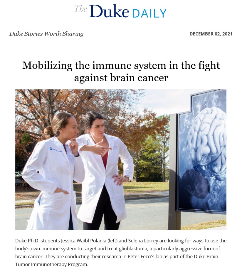
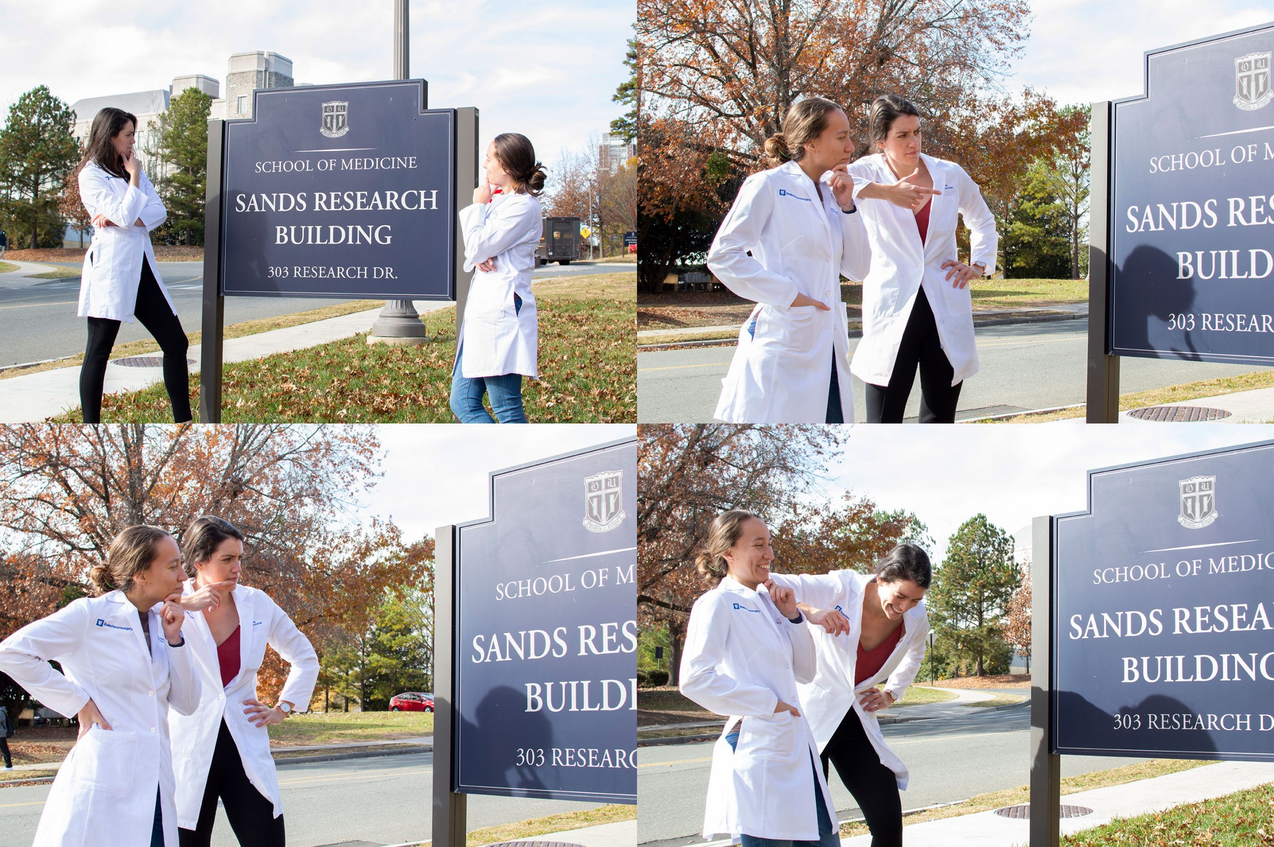
Backup plan secured, it was time to get a little silly. I spied a sign by the side of the building, so I asked the students to pose next to it and give me their best “mystery-solving detective face.” The students were totally on board, had some fun with it, and gave me a few nice poses:
Once I got back to my desk, the Photoshop magic began. I took a couple of the photos and wiped the sign clean with the Clone Stamp, and then used the Healing Brush to help make the color gradations in the recreated sign more natural and less “Clone Stampy.” I took extra care to preserve the shadows cast on the sign, so as to retain more realism in the final product.
Once that was done, the rest was easy. I pulled a stock photo and placed it on the sign, using the Distort function to make it align with the sign’s perspective. I then desaturated the stock image, recolored it blue with the Hue/Saturation function, and changed its layer blend mode to Overlay so that the texture of the sign came through. Finally, I used the Pen tool to draw a simple selection around the edges of the sign, inverted that selection so it selected everything except the sign, and turned that selection into a layer mask for the stock image layer. That clipped the stock image so it did not bleed off the sign.
Here are the final illustrations:


I ended up going with the first illustration, as the background was cleaner (no lamp post or UPS truck), you could see both students’ faces better, and there’s a nice left-to-right line of sight that leads into the illustration. So that illustration became the primary image for the story on our website, while the portrait was used as a secondary image. I also used the second illustration, plus some of the outtakes from the photo shoot, in a collage for a social media post.
This effort resulted in a nice placement for the story. I pitched it to the university’s internal news office, and they used it the next day as the top item in the university’s daily newsletter (a significant channel for us). The newsletter’s editor specifically noted to me how he found the illustration image very striking, so that obviously helped this piece garner top billing in the newsletter.
That placement helped make this story The Graduate School’s most read piece in 2021. What’s more, the students told me that because of the attention the story received, a number of people had reached out to them and some had even shared personal stories about experiences with brain cancer. I love it when everything comes together and produces a visual that catches the eye, helps tell the story, earns the content better placement, gives my interns a higher-impact piece for their portfolio, and results in positive feedback not only for the people working on the story, but also for the subjects featured in the story.