In the BBC Victorian miniseries “Cranford,” there’s a scene where Dr. Harrison, fresh out of medical school and newly settled in a tiny country hamlet, is confronted with his first case — a patient who’s suffered a compound fracture to his arm. While the people of the town, including Dr. Harrison’s elder counterpart and employer, are advocating amputation — considered the standard treatment for such an injury — the young doctor has the bold notion that he can fix the man’s injuries without sawing off his limb. At one point, in trying to assuage the doubts of the town’s ladies, he tells them, “It’s not so much that it is revolutionary to carry out this operation; more that it’d be backward not to.”
That’s kind of how I felt after I read The New York Times’ outstanding package on a deadly avalanche and then the Poynter story about the making of the package.
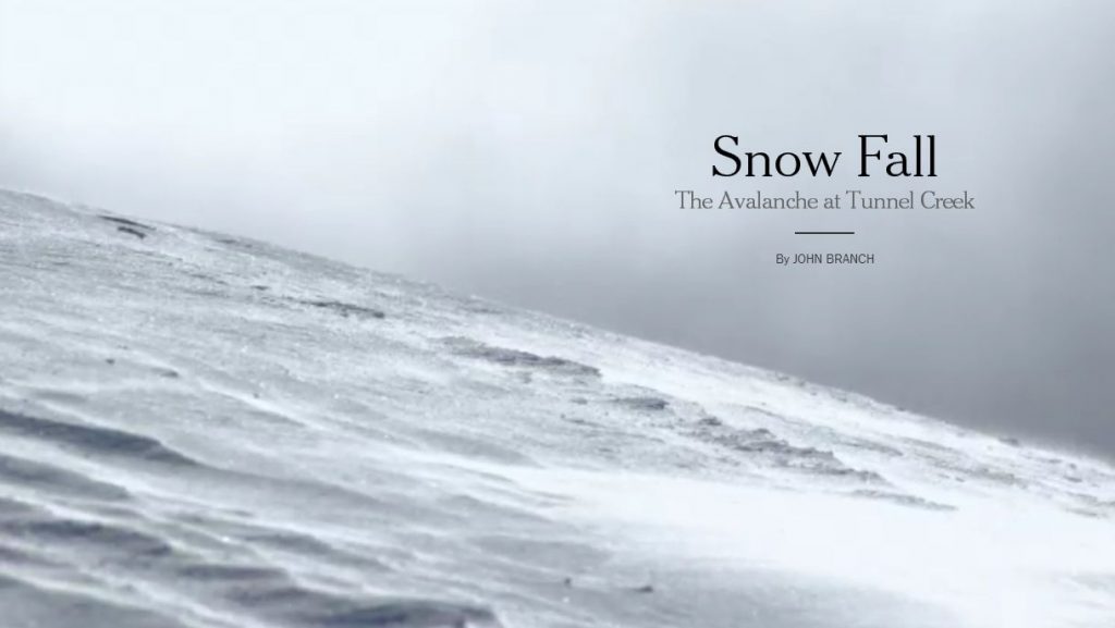
I’ll explain what I mean by that in a second. First things first, though: This is a tour de force of journalism and multimedia presentation, the kind of work one would expect from The NYT. The praise it has been receiving is well-deserved.
That said, I do think it’d be going a bit overboard to say, as the Poynter story does, that this package seamlessly blends text and multimedia elements into one narrative flow. The Poynter story quotes NYT graphics editor Steve Duenes on this subject:
The goal, Duenes said, was to “find ways to allow readers to read into, and then through multimedia, and then out of multimedia. So it didn’t feel like you were taking a detour, but the multimedia was part of the one narrative flow.”
That, I think, should definitely be the goal for multimedia storytelling, but I don’t think The NYT quite achieves it here. The Poynter story dissects the difference between this package and the typical NYT online package:
You can see the difference clearly in this side-by-side comparison. The left side shows how multimedia is segregated in a typical New York Times article (the Sunday Magazine profile of Jerry Seinfeld), and on the right side is the first page of the Snow Fall project.
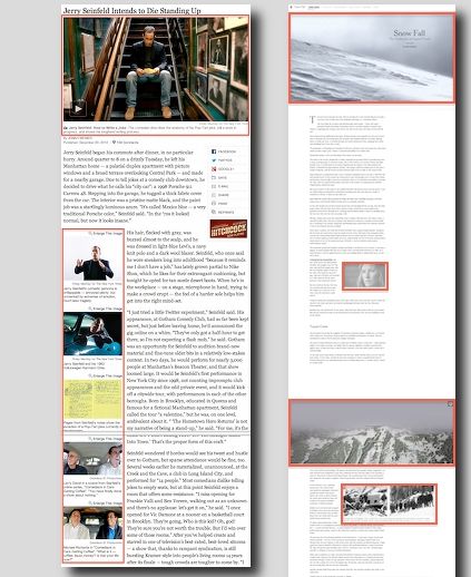
So the multimedia pieces are placed in spots on the page where they make sense contextually, instead of all in one designated area. That’s great, but it does make one wonder why this is considered a big deal. How long has it been since we’ve gained the ability to embed multimedia elements anywhere on webpages? Hence my “it’s not so much that it’s revolutionary” remark above. When you get down to it, this change is mostly a cosmetic one, and long overdue for online journalism.
Where The NYT comes up short in achieving a truly cohesive flow is in the much more important, and much harder, next step of actually weaving those multimedia pieces into the narrative. If you break it down, what we have here is still a text narrative that stands on its own. Most of the multimedia components still feel bolted on and are tangents rather than a crucial part of the main narrative. As such, most of the multimedia pieces still feel more like detours. Actually, in some cases they feel more like roadblocks, because they’re now placed more directly in the path of the readers. This is actually more disruptive to the readers’ experience because you are forced to break your train of thought whenever you encounter one of these roadblocks and it’s much harder to ignore them when you have to scroll past them to continue the narrative you were reading.
A quick example: In the first chapter of the story, there’s a section that lays out a geographic overview of Tunnel Creek, the site of the avalanche. The section starts out with three paragraphs of narrative that describe the area. You then scroll into a 30-second flyover of that area, and then back to the text, which picks up where it left off before the flyover. The flyover itself is stunning, and I love the visual transition of the screen darkening as you scroll from the text into the flyover. However, as I viewed the flyover, I found myself fighting the urge to scroll back up and match each point highlighted in the graphic to the description of it in the text above to get more context, which ends up splitting my attention. And then after the flyover ends, I scroll down and the first words I read are “It is a term with broad meaning.” What term is that? Why would I remember when I just had my attention diverted from the text narrative for 30-plus seconds? So I need to scroll back up to pick up where the text had ended, which disrupts the mental flow. The narrative doesn’t continue through the flyover; it hops over it.
It seems like this package, as great as it is, still doesn’t stray that far from the storytelling mentality that accepts the primacy of the text narrative. Now, I’m a text fan myself, but I also recognize that there are times where other formats can more effectively and more efficiently deliver the information. The example above strikes me as one such instance. Why make people read a text description and then have to mentally match it up with what they see in the flyover? Much of what’s in the three paragraphs just before the flyover can be easily integrated into the graphic and presented as one piece, not two, that transitions naturally into the next segment of the narrative. This way, the multimedia propels the narrative forward rather than interrupts it.
One part in the avalanche story that does achieve this is in the Descent Begins chapter. At one point, as the text narrative describes what each person was doing just before the avalanche hit, an accompanying graphic shows the location of that person as you scroll past his/her name on the page.
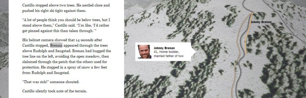
Here, rather than interrupt your train of thought, the multimedia component aids it by quickly visualizing what you’re reading to improve comprehension. To me, that’s the direction in which we need to go in order to create truly seamless blends of multimedia elements into one narrative.
The NYT’s avalanche story is a gorgeous piece of work, mainly because of the scale of the package, the beautiful design, and the quality of each component. There is, however, still much room for improvement in terms of weaving those individual components into a natural flow. Nonetheless, it’s great to see journalistic work like this. This package may not have created a seamless experience, but it’s certainly an evolutionary step in the right direction.